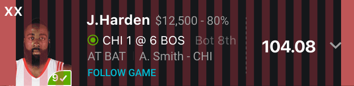
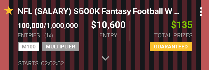
Draftkings' new design system is a fresh, elevated version of the popular platform. The system goes hand in hand with the product and brand aesthetic and character, providing flexible structure that is clean, communicative, holistic and scalable - yet still bold and energetic.
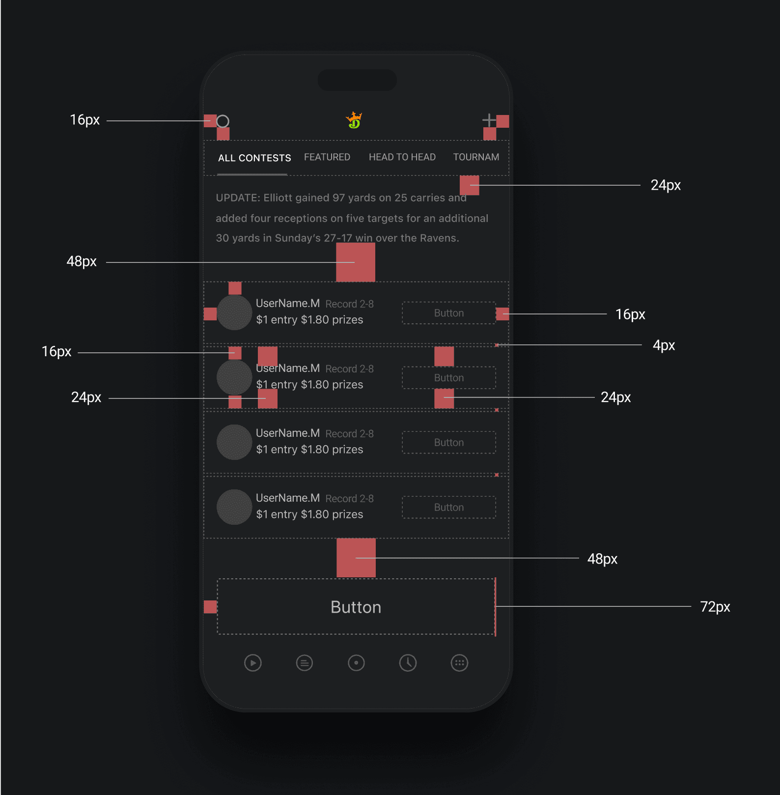
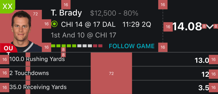
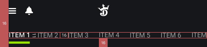
8-72 Grid & Spacing System
The new grid and spacing system provided clear design rules, which acted as the foundation for the new design. Following this system allowed Draftkings to:
1. Improve information architecture
2. Keep the content organized
3. Enhance visual hierarchy & scanability
4. Better support cross platforms.
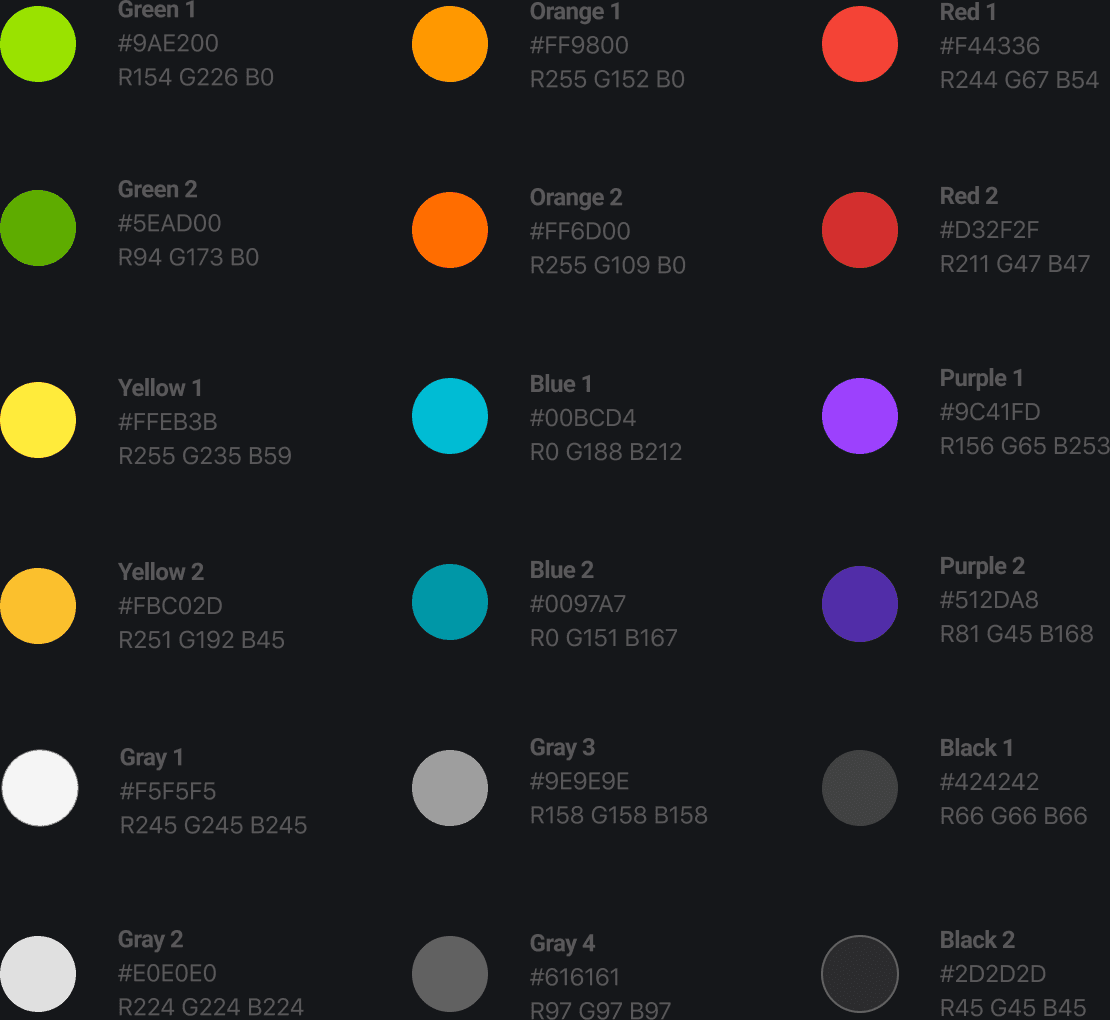
Color Palette
Communicative | Playful | Sporty
While consistent with the current brand color scheme, the modified color palette provides clear and intuitive communication. The palette begins with primary colors and continues with supporting colors, filling in the spectrum and creating a complete palette for cross platform usability.
Primary Colors:

Secondary Colors:
Iconography
The new icon system was designed to be visually distinct, clear, communicative, and better draw the user's attention and call to action. All icons are unified under the same design style and execution to create an organic and universal brand and design language.


Illustration & Motion Design
Communicative and Playful
Using new branded illustrations and motion design provided a more playful and powerful way to communicate, draw attention and increase engagement.
Responsive parallax transitions keep the user engaged with onboarding in a playful way
Banner transitions draw attention and take advantage of the page 'real estate'
Unified Brand & Product Experience